 |
|
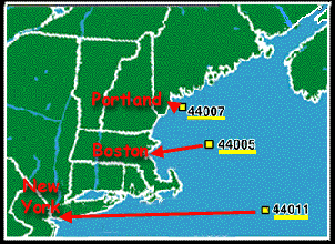
Let's look at monthly plots of one climate measurement -- air temperature -- for three large coastal cities near the LATITUDES of the buoys.
- Portland, Maine <=> #44007 ("Portland" buoy)
- Boston, Mass. <=> #44005 ("Gulf of Maine" buoy)
- New York, New York <=> #44011 ("Georges Bank " buoy)
Click here if you prefer to choose three large coastal cities nearer to where you live ("Alternate City & Buoy Pairs").
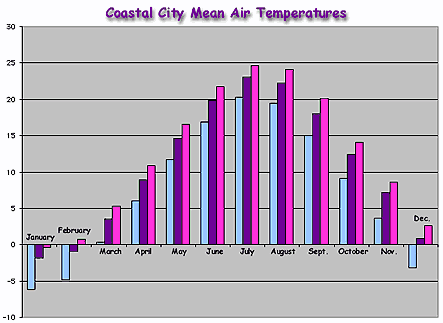
At right (>>>) is a bar graph of monthly mean air temperatures for the coastal cities shown above (^^^). Each color represents a different city.
Data are averaged over the period 1961 - 1990. (From the "Normal Mean Temperature for many U.S. cities" website.)
 |
- Check out the map of coastal
city locations to see the relative latitude of these three cities.
Then look at the bar graph directly above (^^^).
- Which bar represents the LOWEST mean monthly
air temperature:
- Light blue (leftmost)?
- Purple (middle)?
- Dark pink (rightmost)?
- Which bar represents the HIGHEST mean monthly
air temperature:
- Light blue (leftmost)?
- Purple (middle)?
- Dark pink (rightmost)?
- Based on latitude, can you guess which color
represents which coastal city:
- Light blue?
- Purple?
- Dark pink?
- You can check your answers by accessing
the "Normal
Mean Temperature for many U.S. cities" website.
- What temperature units are used on this bar graph?
- Which bar represents the LOWEST mean monthly
air temperature:
- Does the relationship between coastal city latitude and monthly air temperature agree with your expectations?

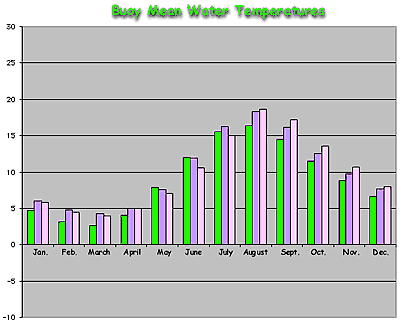
2. Look at the bar graph at left (<<<). It shows the mean air temperatures for the three buoys shown in the map above. Like the bar graph of coastal city air temperatures, each color represents a different buoy.
You may also want to reference "Historical" weather or climate data for these buoys:
- For each month in the graph just above (^^^), which
bar represents the LOWEST mean air temperature:
- Brown (leftmost bar)?
- Yellow (middle bar)?
- Dark blue (rightmost bar)?
- Which bar represents the HIGHEST mean air temperature
for each month:
- Brown (leftmost)?
- Yellow (middle)?
- Dark blue (rightmost)?
- The buoy data are displayed by latitude IN THE SAME
ORDER as the bar graph of coastal city air temperatures.
- Does this help you figure out which buoy corresponds
to:
- Brown (leftmost bar)?
- Yellow (middle bar)?
- Dark blue (rightmost bar)?
- Does this help you figure out which buoy corresponds
to:
- Does the relationship between buoy
latitude and monthly mean air temperature (just above, ^^^) agree with
the relationship between coastal city latitude and monthly
air temperature?
- In other words, for each month, is the buoy with the lowest mean air temperature ALWAYS at the same latitude as the coastal city with the lowest mean air temperature?
- Also -- for each month -- is the buoy with the highest mean air temperature ALWAYS at the same latitude as the coastal city the highest mean air temperature?
- Can you guess why or why not?
- HINT: Is latitude the ONLY difference between the buoy locations? What about each buoy's distance from the coastline?
3. At right (>>>) is a bar graph that shows buoy mean water temperature data for the same three buoys.
- What temperature range (lowest to highest) is covered by these observations?
- Is this temperature range greater than, less than, or equal to that spanned by the buoy air temperature data?
- Can you guess why?
- For each month, which bar represents the LOWEST
mean water temperature:
- Green (leftmost)?
- Light purple (middle)?
- Light pink (rightmost)?
- Which bar represents the HIGHEST mean monthly water
temperature for each month:
- Green (leftmost)?
- Light purple (middle)?
- Light pink (rightmost)?
- The buoy mean water temperature data (just above,
^^^) are shown IN THE SAME ORDER as the previous two bar graphs.
- For each month, does the trend in buoy mean AIR temperature match the trend in buoy mean WATER temperature? In other words, for each month is the buoy in the "warmest" air also the buoy in the "warmest" water? Likewise, is the buoy in the "coolest" air always the buoy in the "coolest " water?
- Can you guess why or why not?
- HINT: Water has a high "heat capacity."
This means that it takes a lot of energy to heat or cool it (change
its temperature). Thus, the oceans heat and cool more slowly than the
land or the atmosphere. You can learn more about this by doing the "Ocean
Seasons" activity.
- You may also want to reference "Historical" weather or climate data from the buoys:
 |
 |
 |
 |