 |
|
- Note that, for this example, only the measurements with bold letters are available. When you access National Data Buoy Center website, all data with this icon are available as graphs.
To access "Historical data" for any buoy, begin at the National Data Buoy Center Station Information page. After you've found your region of interest, click on either the "Station List" or map of buoy locations. "Historical Data & Climatic Summaries" links are found near the bottom of each station page.
| Wind Speed: | 0.0 kts ( 00 m/s) | |
| Wind Gust: | 1.9 kts ( 1 m/s) | |
| Wave Height: | 2.3 ft (0.7 m) | |
| Dominant Wave Period: | 10.0 sec | |
| Atmospheric Pressure: | 30.17 in (1021.7 mb) | |
| Pressure Tendency: | -0.0 mb (Steady) | |
| Air Temperature: | 70.5 F ( 21.4 C) | |
| Water Temperature: | 67.8 F ( 19.9 C) |
You may want to access three examples of "Historical Buoy Data":
At these "Historical data" pages, you'll find quality controlled data (and descriptions) from the current month and previous months of the year. For some buoys, you'll also be able to access standard meteorological data gathered since 1978!
Of particular interest are long-term weather -- also known as climate -- data. "Climatic summary plots" are available for the following measurements:
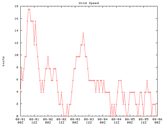
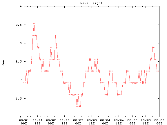
- wind speed (shown below, VVV)
- air temperature
- sea temperature
- air-sea temperature
- sea level pressure
- peak wind
- wind gust
- significant wave height**
- average wave period**
- dominant wave period**
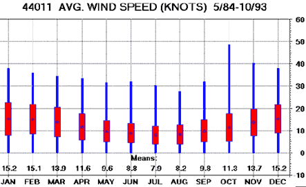
The plot at right (>>>) shows monthy average data collected over many years (in this case, wind data from the "Georges Bank" buoy, #44011, from May 1984 to October 1993).
**To learn more about significant wave height and wave periods, go to the "How Buoy Data Change over Hours" section.
 |
- Click on the graph icons
 for "Wind Speed" and "Wave Height" in the table above.
- Check out the vertical and horizontal axes covered
in both graphs.
- What time range do they cover?
- What is the variation in wind speed during this time ? What units are plotted?
- What is the variation in wave height during this time? What units are plotted?
- Compare the two graphs.
- Does the graphs indicate whether there is a general relationship between wind speed and wave height?
- If so, what might that relationship be?
- Go to the latest graphs of "Wind Speed"
and "Wave Height" for some of these buoys:
- Portland
- Gulf of Maine
- Georges Bank
- a buoy
located closer to you (access from the "clickable map"
at the National
Data Buoy Center Station Information page).
- For each buoy, how does "Wind Speed" compare with "Wave Height"?
- How do these measurements compare from buoy-to-buoy?
- How do the latest graphs from the
"Gulf
of Maine" buoy compare to the "Wind
Speed" data from early August 1998?
- Can you guess why they are similar or different?
- How do the latest graphs from the
"Gulf
of Maine" buoy compare to the "Wave
Height" data from early August 1998?
- Can you guess why they are similar or different?
- Portland
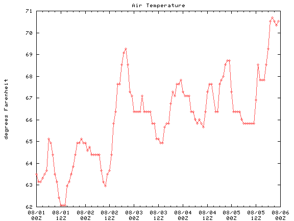
- Click on the graph icons
for "Air Temperature" and "Water Temperature" in the
table above.
- What units are plotted?
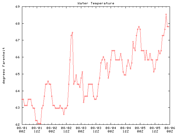
- What is the range in air temperature during this time? Do you see any distinct trends in the data?
- What is the range in water temperature during this time? Do you see any distinct trends in the data?
- Compare the two graphs.
- Does the graphs indicate whether there is a general relationship between air temperature and water temperature?
- If so, what might that relationship be?
- Go to the latest graphs of "Air Temperature" and "Water Temperature" for some of these buoys:
- Gulf of Maine
- Georges Bank
- a buoy
located closer to you
- For each buoy, how does "Air Temperature" compare with "Water Temperature"?
- How do these measurements compare from buoy-to-buoy?
- How do the latest air temperature graphs
from the "Gulf
of Maine" buoy compare to the "Air
Temperature" data from early August 1998?
- Can you guess why they are similar or different?
- How do the latest water temperature
graphs from the "Gulf
of Maine" buoy compare to the "Water
Temperature" data from early August 1998?
- Can you guess why they are similar or different?
- [To learn more about data trends, click here to access the "Analyzing Greenhouse Gases Over Time" activity]
- Suppose that wind speed is measured daily at the
"Georges Bank" buoy (#44011) during April 1998. Furthermore, suppose
that the wind speed measurements at this station stay fairly constant over
the 30-day period. When all the wind speeds are added together and divided
by 30 they are found to be 15 knots. In this simple example, 15 knots is
the mean wind speed for that month.
- On the graph just above,
the mean wind speeds for each month over a total period of 114 months
(May 1984 - October 1993) are shown.
- The blue lines show the wide range of mean wind speeds observed during that particular month; for example, the wind speeds measured over 10 "Octobers" (1984 - 1993) range from 0 to almost 50 knots!
- The red box covers most of the mean wind speeds observed during that month over all the years.
- The blue "dot" shows the calculated
mean of the observed wind speeds; this is also shown as a number
just above the month name.
- How many "Aprils" are included in this graph?
- Was the mean wind speed encountered during April 1998 (as described in the paragraph above) within the typical range of "April mean wind speeds"?
- Was it above or below the average mean for months of April shown in the graph?
- Why doesn't the graph go below zero?
- On the graph just above,
the mean wind speeds for each month over a total period of 114 months
(May 1984 - October 1993) are shown.
 |
 |
 |
