 |
|
If you'd like to study three large coastal cities nearer to where you live, begin at the Normal Mean Temperature for many U.S. cities website. Be sure that this webpage provides monthly data for the coastal cities you'd like to investigate.
- Use an altas to determine the LATITUDE of each coastal city. Try to choose three cities that span at least 2 degrees of latitude.
Then go to the National Data Buoy Center Station Information webpage.
- Find three buoys whose LATITUDES closely match those of your coastal cities!
- In other words, try to find a buoy within 0.5 degrees of latitude for each of your three coastal cities.
After ensured that your three coastal cities that have buoys nearby, return to the Normal Mean Temperature for many U.S. cities website.
- For each city, write down MEAN AIR TEMPERATURE data FOR EACH MONTH
- Plot these values on a bar graph similar to the one shown below (VVV).
- Be sure to keep assign a one color to each coastal city.
- Try to follow the same scheme as used below (light blue, purple, dark pink).
- Plot the data so that -- for each month:
- The northernmost coastal city is plotted at left (in light blue)
- The "middle" latitude coastal city is plotted in the middle (in purple)
- The southernmost coastal city is plotted at the right (in dark pink).
- Be sure to keep assign a one color to each coastal city.
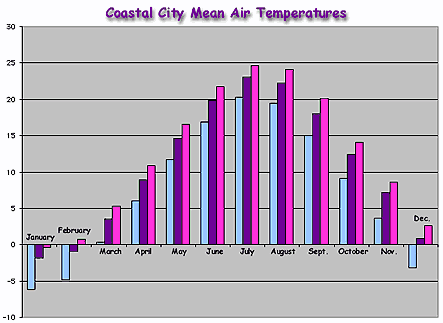
Your graph may look similar to the "Mean Air Temperatures" at right (>>>) for Portland, Boston and New York.
Use YOUR data graph to answer the "Key Questions" below.
 |
- Look at the bar graph
of monthly mean air temperature for your three coastal cities.
- What temperature units were used on your bar
graph?
- How does these temperature units compare with those used in the graph shown above (^^^)?
- On your graph, which bar represents the LOWEST
mean monthly air temperature:
- Light blue (leftmost)?
- Purple (middle)?
- Dark pink (rightmost)?
- On your graph, which bar represents the HIGHEST
mean monthly air temperature:
- Light blue (leftmost)?
- Purple (middle)?
- Dark pink (rightmost)?
- Is there a tie between your coastal cities' latitudes and their mean monthly temperature?
- Does the relationship between coastal city latitude and monthly air temperature agree with your expectations?
- What temperature units were used on your bar
graph?
- Create a bar graph of "Buoy Mean Air Temperature" for the three buoys near your coastal cities.
- Begin at the National Data Buoy Center Station Information webpage.
- For each buoy, find the "Historical Data & Climatic Summaries" links near the bottom of each buoy's "Station Page."
- Plot monthly mean air temperatures on a bar graph
similar to the one shown below.
- Be sure to keep assign a one color to each
buoy.
- Try to follow the same scheme as used below (brown, yellow, dark blue).
- Plot the data so that -- for each month:
- The northernmost buoy is plotted at left (in brown)
- The "middle" latitude buoy is plotted in the middle (in yellow)
- The southernmost buoy is plotted at the right (in dark blue)
- Be sure to keep assign a one color to each
buoy.
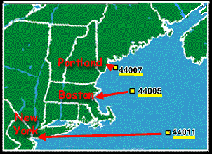
Your graph may look similar to the one at right (>>>). This map shows the mean air temperatures for the three buoys near Portland, Boston and New York. (Click here to see a map of the buoy locations.)
Use YOUR data graph to answer the questions below.

Look at the bar graph of mean air temperature for the three buoys near your coastal cities.
- For each month, which bar represents the LOWEST
mean air temperature:
- Brown (leftmost bar)?
- Yellow (middle bar)?
- Dark blue (rightmost bar)?
- Which bar represents the HIGHEST mean air temperature
for each month:
- Brown (leftmost)?
- Yellow (middle)?
- Dark blue (rightmost)?
- FOR YOUR DATA, does the relationship between buoy
latitude and monthly mean air temperature agree with the relationship between
coastal city latitude and monthly air temperature?
- In other words, for each month, is the buoy with the lowest mean air temperature ALWAYS at the same latitude as the coastal city with the lowest mean air temperature? Also -- for each month -- is the buoy with the highest mean air temperature ALWAYS at the same latitude as the coastal city the highest mean air temperature?
- Can you guess why or why not?
- HINT: Is latitude the ONLY difference between the buoy locations? What about each buoy's distance from the coastline?
3. Create a bar graph of "Buoy Mean Water Temperature" for the three buoys near your coastal cities.
- Begin at the National Data Buoy Center Station Information webpage.
- For each buoy, find the "Historical Data & Climatic Summaries" links near the bottom of each buoy's "Station Page."
- Plot monthly mean water temperatures on a bar graph similar to the one shown below
- Be sure to keep assign a one color to each buoy.
- Try to follow the same scheme as used below (green, light purple, light pink).
- Plot the data so that -- for each month:
- The northernmost buoy is plotted at left (in green)
- The "middle" latitude buoy is plotted in the middle (in light purple)
- The southernmost buoy is plotted at the right (in light pink)
Your graph may look similar to the one at right (>>>). This map shows the mean air temperatures for the three buoys near Portland, Boston and New York. (Click here to see a map of the buoy locations.)
Use YOUR data graph to answer the questions below.
- What temperature range (lowest to highest) is covered
by these observations?
- Is this temperature range greater than, less
than, or equal to that spanned by YOUR GRAPH of buoy AIR temperature
data?
- Can you guess why?
- Is this temperature range greater than, less
than, or equal to that spanned by YOUR GRAPH of buoy AIR temperature
data?
- For each month, which bar represents the LOWEST
mean water temperature:
- Green (leftmost)?
- Light purple (middle)?
- Light pink (rightmost)?
- Which bar represents the HIGHEST mean monthly water
temperature for each month:
- Green (leftmost)?
- Light purple (middle)?
- Light pink (rightmost)?
Look at the two graphs you plotted for mean monthly (1) buoy air temperature and (2) buoy water temperature.
- Does the trend in buoy mean AIR temperature match
the trend in buoy mean WATER temperature?
- In other words, for each month is the buoy
in the "warmest" air also the buoy in the "warmest"
water? Likewise, is the buoy in the "coolest" air always
the buoy in the "coolest " water?
- Can you guess why or why not?
- HINT: Water has a high "heat capacity." This means that it takes a lot of energy to heat or cool it (change its temperature). Thus, the oceans heat and cool more slowly than the land or the atmosphere. You can learn more about this by doing the "Ocean Seasons" activity.
- In other words, for each month is the buoy
in the "warmest" air also the buoy in the "warmest"
water? Likewise, is the buoy in the "coolest" air always
the buoy in the "coolest " water?
 |
 |
 |
 |